CONTENT DESIGN
A big new orange microsite and a 300% increase in traffic in 4 months
It was 2012. Britain was hosting the Olympics, Obama was winning hearts and minds in the US and a new Opinion editor wanted to make his mark on the Independent newspaper.
VIEW THE GALLERY BELOW TO SEE THE PROJECT.

This is the Independent Opinion section, as was. The section was manually updated overnight, with few updates in the day. There was nothing attention-grabbing and it was vicually unappealing.

The top section of the site always displayed the day's cartoon, then a gallery of uninteresting images and other cartoons.

The section suffered from a high bounce rate and poor navigation. From the site analytics and readers' letters we knew readers liked to find their favourite commentator or see opinion on the top stories of the day. They found this hard to find and sometimes gave up. When they did find it, they would leave the site immediately after, rather than looking at other topics. The brief from the Opinion Editor was that he wanted the main colour to be orange, because that's his favourite colour – and to celebrate and champion our big name opinion writers. Oh and also, we would be working on a shoestring and ready in three months. I went to the developers and said, can we make everything more dynamic, with a plan for scrolling nicely on a phone? Yes, they said. Can we make the same layout on a phone and a tablet and a laptop? No, they said. So that gave me some firm parameters. The design team were cool with working in a palette of black, white and... orange.

They took my scrappy pen doodle and came out with ten flashy-looking designs. The editor didn't like any of them. 'Make it more daily beast' he said and ' Can the scrolling part be could something snazzy. IV Drip!' We were making progress.

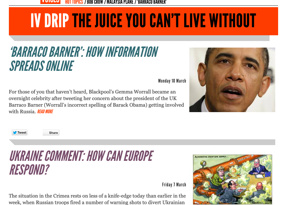
The IV Drip became the scrolling section of the site that was the first part you saw on a phone. It got a clearer-to-read design. Attention-grabbing images and headlines were in caps, no more than three lines in depth. We had a reader panel giving feedback on these details. I would go back and forth between them, the Editor and the designers. Sometimes i would bring snacks.

On your phone or ipad, you'd be fed the drip first.

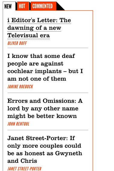
Our heavyweight opinion writers and editors got their own section that was manually edited all day to showcase the best performing articles. The designers and I took a long time working on the spacing between the sections. We tested this on a small group of readers to see what looked clearest to them. Instead of the old sections of 'Most commented' and 'most shared' we now had 'Commented' and simply 'Hot'. Our reader group liked this. They also liked the orange... and the use of caps for the sections.

As much as we loved our cartoons, one of the first decisions was to move them out of the top spot and move them down, way down. This was because readers would look once and bounce off. We wanted them to stick around.

One of our 'must-haves' - derived from both what the Editor wanted and what the data told us was easy, quick navigation to your favourite writers. To save in-fighting, these were alphabetical. We also mixed in our new up-and-comers alongside the established names.

A scrolling gallery replaced the 'cartoon of the day' this showed the top 5 stories of the day ranked by views. A dedicated editor monitored analytics throughout the day and monitored this page. It was a hit - dwell-time and reader volume increased immediately due to this one change.

The additional tabs evolved through later iterations as we learned more about user behaviour but also what internal stakeholders wanted to give more prominence. 'Campaigns' was important to the newspaper's owner, for example, but not all campaigns smashed traffic records.

As the section developed we saw dwell time increase. Each article linked to another related article, so users would be able to navigate through the topics that interested them seamlessly.

First-thing in the morning, I would analyse the trending topics of the day, then again at lunch, then again at 6pm, so the editors could commision relevant pieces that users wanted to read.

In the end we top-loaded the toolbar even further with sections, hot topics and trends. Some users preferred to navigate this way, some preferred to scroll the gallery and feeds. Either way, they were spending more time on the site and the extra commisssioning power delivered hot topics throughout the day. The result was a 300% uplift in traffic after the first 4 months.